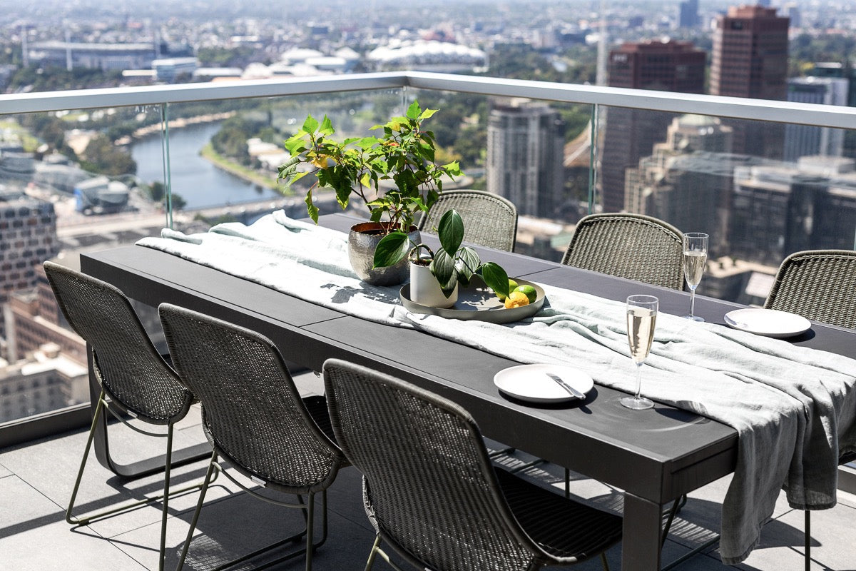
When it comes to arranging your home’s furniture and selecting décor items, getting the proportions right can be tricky. It’s a crucial yet often overlooked aspect of interior design – we tend to focus on things like light, colour, lines and texture.
But how does each item of furniture and décor fit in with each other, as well as the overall space available in the room? Cluttered spaces tend to feel too busy, while expansive empty spaces can feel sterile and unhomely.
Here are some tips for nailing the Goldilocks Principle in your home – not too much, not too little… just right.
#1 – General rules for the entire home
Ever fall in love with a piece of furniture, only to bring it home and realise it’s far too big or small for the space you intended it for?
A good way to avoid this common issue is to measure the piece of furniture’s width and depth, and tape the dimensions on your floor to determine how much floorspace it will consume. If this all seems too hard, alternatively you could engage the FURNISHD. online interior design team and we will take care of this for you!
Uniformity in the height and width of your furniture is dull. You can combat this by playing with vertical spaces, for example using tall lamps and high shelving to mix things up. Large or bulky accessories on slim, delicate furniture always looks awkward. Avoid doing things like placing a massive candle on a small and dainty corner table, for instance.
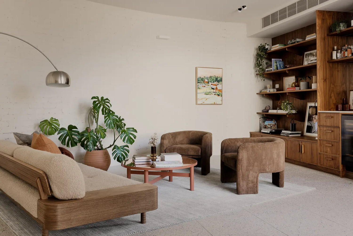
Rugs are fantastic for creating a spatial border around sofas or coffee tables, as well as to “zone” specific areas in more open-plan spaces where the living sections are less defined.

#2 – Getting the proportions right in the living room
Everyone wants a homely living room that radiates a luxurious aesthetic and laid-back atmosphere, right? There are simple hacks for ensuring that a chilled afternoon on the sofa feels comfortable.
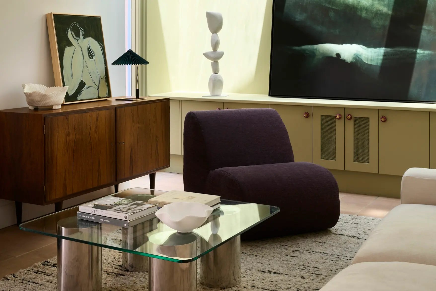
First of all, make sure that the height of your coffee table’s surface matches the height of your sofa’s seat cushions. The larger your TV, the larger your entertainment unit needs to be – big screens on small benches look silly, as do small screens on ginormous entertainment units!
Whatever the width of your TV is, your couch should be roughly two-and-a-half times this distance from the screen. So for example, if your TV is 1m wide, place it 2.5m from your sofa. The central point of your TV screen should be approximately 1m from the floor.

#3 – Achieving good proportions for your bedroom’s interior design
The bedroom is easy. The larger the bed, the larger the bedside table(s). Ideally, you want 80cm-wide bedside tables for a king-sized bed, 55cm-wide tables for a queen, and so on.
When choosing a bedside lamp, consider the height of the bedhead – the two should be more or less even. Of course, function is the priority so make sure your lamps are tall enough to serve their purpose when you are sitting up in bed reading.
Speaking of lighting…
#4 – How to get your home’s lighting proportions right
There’s nothing more annoying than constantly ducking under low-hanging pendant lamps. They shouldn’t overly intrude on a room’s vertical space, nor should they hang too high so as to come across detached and distant.
When done right, pendant lights can be great for evenly dispersing light across open-plan spaces while subtly serving as a soft divider between kitchen and dining/living areas, for example.
For areas where there’s nothing below pendant lighting (i.e. open living space rather than kitchen benchtops), consider that tall people may need up to 2m clearance when walking underneath. Pendant lights that hang 2.5m high are perfect.

#5 – Even distribution of wall-hung accessories
When it comes to hanging pieces of artwork or other décor items on your walls, don’t be afraid to go big. Way too many people try to play it safe and opt for things like small picture frames, which don’t fill the space adequately. Remember: small pieces can easily be made bigger with larger frames!
Of course, too much stuff on your walls can also create a cluttered feel. Sometimes less is more – better to go for a few carefully chosen wall-hung accessories that consume a lot of space, rather than lots of small items.
Try to avoid going any higher than eye level. This tends to mess with the dimensions of the room and the artwork ends up feeling disassociated with the rest of the décor.

#6 – Proportionate display of colour tones
Proportioning in interior design isn’t just about space – the best home interiors have a well thought-out combination of colours in just the right amounts.
A good tip for proportioning colours appropriately is to have one colour for the walls, rugs and prominent furniture like couches, and then have another colour for smaller components like throws, chairs and lamps. This second colour should be less pronounced than the room’s prime colour tone.
Finally, adorn the space with a handful of items in a third, more visually striking colour… artwork, plants and other decorative items work well. The ratio should work out at about two-thirds for the first colour, one-third for the second colour and then literally just a few splashes of the third colour around the room.
Sign up to FURNISHD. for more interior design tips
FURNISHD. allows you to take the guesswork out of your interior design, with our fantastic online interior design tool. Sign up today or contact us for more information. We’ve also got some killer hacks for how to achieve Scandinavian, bohemian, industrial or cottage-style interior design for your home.
